How to Read Japanese Candlestick Charts
Learn how to read Japanese candlestick charts to identify market trends and price reversals. This guide covers anatomy, psychology, and advanced patterns.
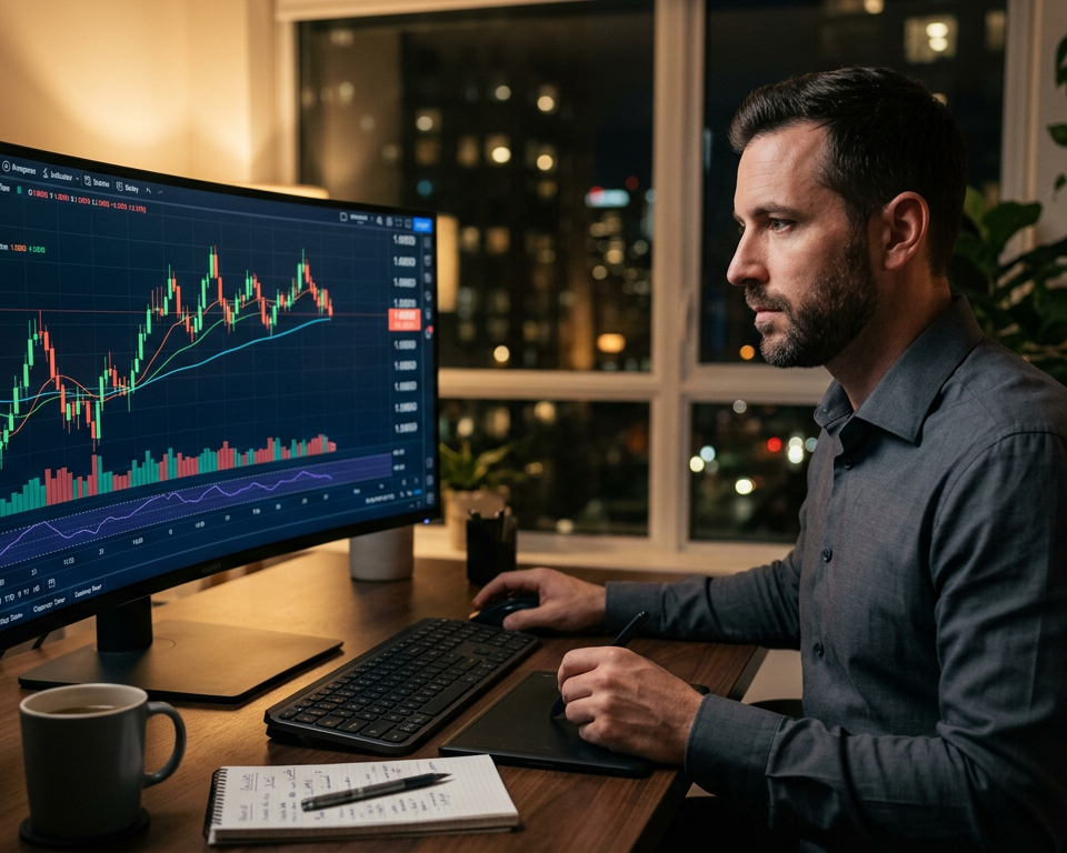
Effective technical analysis is the cornerstone of successful trading, and learning how to read Japanese candlestick charts is perhaps the most vital skill a trader can acquire. Originally developed by 18th-century Japanese rice traders, these charts have survived the test of time because they provide a visual representation of market psychology that bar charts or line charts simply cannot match. By understanding the relationship between the open, high, low, and close prices, traders can gauge the sentiment of market participants and predict future price movements with higher accuracy.
What Is a Japanese Candlestick Chart?
A Japanese candlestick chart is a financial visualization tool used to describe price movements of a security, derivative, or currency. Each "candle" typically represents one day, and illustrates the opening, highest, lowest, and closing prices. These charts are essential for identifying market trends and psychological shifts through visual patterns.
Access 40+ Professional Trading Tools — No Credit Card Required
The Anatomy of a Single Candlestick
To understand how to read Japanese candlestick charts, you must first break down an individual candle into its fundamental parts. Every candle consists of three main elements: the real body, the upper shadow, and the lower shadow (also known as wicks or tails).
The real body is the rectangular part of the candle. It represents the price range between the opening and closing prices of the period. If the close is higher than the open, the body is typically green or white, indicating a bullish period where buyers dominate. Conversely, if the close is lower than the open, the body is red or black, signifying a bearish period controlled by sellers. The vertical lines extending from the body are the shadows. The upper shadow represents the highest price reached during the period, while the lower shadow represents the lowest price.
The length of these components provides immediate context. A long body suggests strong momentum in the direction of the candle’s color. For example, a large green body indicates that buyers were aggressive from the start to the end of the session. Short bodies, on the other hand, suggest consolidation or indecision. By learning the anatomy, you begin to see the "story" of the trade: who was in control and how much resistance they faced from the opposing side. Understanding these nuances is a prerequisite for advanced concepts like What Are Candlestick Patterns, which categorize groups of candles into actionable signals.
The History and Philosophy of Candlestick Trading
Before modern computers and high-frequency algorithms, Munehisa Homma, a rice merchant from Sakata, revolutionized market analysis. He realized that while supply and demand influenced prices, the markets were also strongly influenced by the emotions of the traders. He developed the "Sakata Rules" which eventually evolved into the candlestick charts we use today.
The core philosophy of how to read Japanese candlestick charts lies in the belief that "what" is happening (price action) is more important than "why" it is happening (news or fundamentals). To a candlestick trader, all known information is already reflected in the price. The chart reveals the collective psychological state of the market—fear, greed, and indifference. When you see a specific pattern, you aren't just looking at data; you are looking at the footprint of human behavior. This historical perspective is essential because it reminds traders that despite technological advances, human psychology remains the constant driver of market cycles.
Visualizing Trends and Momentum
One of the greatest advantages of these charts is the ease with which a trader can identify the prevailing trend. Unlike line charts that only show closing prices, candlesticks show the volatility within each period. In a strong uptrend, you will typically see a series of large green candles with small lower shadows. This indicates that even when price dipped slightly, buyers were quick to step in.
Conversely, a weakening trend often manifests through smaller candle bodies and longer shadows. This visual "thinning out" of the price action suggests that the dominant side is losing conviction. For instance, if you are in a long position and start seeing candles with long upper shadows followed by small bodies, it indicates that buyers are attempting to push the price higher but are being met with significant selling pressure. This visual feedback is crucial for timing exits. To further assist in identifying market conditions, many traders combine these visual cues with professional Trading Scanners to confirm if the price action matches broader market strength.
Essential Bullish and Bearish Patterns
Once you understand the anatomy, the next step in how to read Japanese candlestick charts is recognizing specific patterns. These are categorised into reversal patterns and continuation patterns. Reversal patterns suggest that the current trend is about to change direction, while continuation patterns suggest that the trend will persist after a brief pause.
A classic example is the "Engulfing" pattern. A Bullish Engulfing occurs when a small red candle is followed by a much larger green candle that completely "engulfs" the body of the previous day's candle. This signifies a massive shift in sentiment from bearish to bullish. On the flip side, the "Hammer" and "Shooting Star" are single-candle patterns that highlight price rejection. A Hammer at the bottom of a downtrend, characterized by a long lower wick and a small body at the top, suggests that sellers tried to push the price down but were violently rejected by buyers. These patterns are foundational to technical analysis and serve as the primary entry signals for many price action strategies across all asset classes, from stocks to forex.
🎸 Start Your Trading Journal
Track, Analyze, and Improve Every Trade You Make
Understanding Volatility Through Shadow Length
The shadows (or wicks) of a candlestick are often more telling than the body itself. Shadows represent the "rejected" price levels during the session. If a candle has a very long upper shadow and a small body at the bottom, it shows that the market reached a high point but lacked the conviction to stay there. This is a sign of resistance and potential downward pressure.
High-volatility environments often produce candles with long shadows on both ends, such as the "High Wave" candle or certain types of "Doji." This indicates a period of extreme struggle where neither buyers nor sellers could gain a clear advantage. For a trader, seeing many long-wicked candles in a row is a signal to exercise caution, as it implies that the market is searching for direction and the What Is the Bid Ask Spread in Trading might widen due to the uncertainty. By measuring the length of these shadows relative to the body, you can calibrate your risk management and determine if a breakout is likely or if the market is stuck in a range-bound whip-saw.
Integrating Candlesticks with Market Context
No candlestick pattern should be traded in a vacuum. Learning how to read Japanese candlestick charts effectively requires looking at where the pattern appears relative to support, resistance, and moving averages. A Bullish Engulfing pattern in the middle of a sideways range is far less significant than the same pattern occurring at a multi-month support level.
Context is king. For example, if you are using technical screening software to find high-momentum stocks, you should look for candlestick patterns that confirm the scanner's data. If the scanner shows high volume and a 5% price increase, you want to see a "Marubozu" (a candle with no shadows) on your chart, which confirms that the move was strong from start to finish. This confluence between technical indicators, fundamental context, and candlestick patterns is what separates professional traders from amateurs. Always ask: "Does this candle make sense given the larger trend?" Using a Pip Calculator alongside these visual patterns can help you precisely determine your risk-to-reward ratio before entering a trade based on a specific candlestick setup.
Advanced Strategies: Multi-Timeframe Analysis
Mastery of Japanese candlesticks involves looking beyond a single timeframe. A "Hammer" on a 15-minute chart might look bullish, but if the Daily chart shows a massive "Falling Window" (gap down), the smaller timeframe signal is likely a trap. Skilled traders use a top-down approach: they identify the overall trend on the Daily or Weekly chart and then look for candlestick entries on the 1-hour or 4-hour charts that align with that trend.
This multi-timeframe perspective helps in filtering out "noise." Often, a series of indecisive candles on a lower timeframe is actually just part of the formation of one large, decisive candle on a higher timeframe. Understanding how multiple candles "blend" into one another is a more advanced technique. For instance, two 30-minute candles can be combined to visualize the hourly candle. If the first 30-minute candle is bullish and the second is a bearish reversal, the combined hourly candle will likely show a long upper wick, signaling a rejection. This hierarchical view ensures that you are trading with the path of least resistance rather than fighting "big money" flows.
Analyzing Market Psychology and Sentiment
Every candlestick is a direct reflection of human emotion in the marketplace. When we see a "Marubozu" candle, we are seeing a state of absolute conviction. There is no hesitation; the price opens at one extreme and closes at the other. This tells the trader that there is significant institutional backing behind the move. Conversely, a "Doji" candle—where the open and close are almost identical—represents a state of equilibrium. It shows that after a period of intense trading, the market participants could not reach a consensus on whether the price should be higher or lower.
By studying these psychological footprints, you can begin to anticipate when a market is reaching "exhaustion." Exhaustion occurs when price moves too far too fast, often resulting in "Climax" candles—large, outlier candles that appear at the end of a long trend. While these might look like strong momentum to an untrained eye, an experienced candlestick reader recognizes them as a sign that the last remaining buyers (or sellers) have entered the market, leaving no one else to push the price further. This foresight allows you to take profits or prepare for a reversal trade while others are still chasing the trend.
The Role of Volume in Candlestick Analysis
While the price action depicted by candlesticks is vital, its validity is often confirmed by trading volume. Volume represents the fuel behind the move. If you see a bullish reversal pattern, such as a Morning Star, forming on very low volume, it may not have enough conviction to sustain a new uptrend. However, if that same pattern appears with a significant spike in volume, it indicates that large institutional players are entering the market at those price levels.
Combining volume analysis with candlestick reading provides a three-dimensional view of the market. It allows you to distinguish between a legitimate breakout and a "bull trap" or "bear trap." For example, a breakout candle that closes above resistance on high volume is a high-probability trade signal. In contrast, a candle that briefly breaks above resistance but closes back below it (creating a long upper shadow) on high volume is a classic rejection signal, suggesting that sellers are still firmly in control of that overhead supply zone.
Practical Tips for Daily Chart Interpretation
Implementing these concepts requires consistent effort and deliberate practice. When you sit down to analyze charts each day, you should follow a structured approach to maintain consistency. Here are additional considerations to keep in mind as you develop your trading approach:
- Review your trading performance on a weekly basis to identify which candlestick patterns have been the most profitable for your specific trading style.
- Document your decision-making process for each trade to build a comprehensive reference library of "good" and "bad" setups.
- Set specific, measurable goals for your trading development over the next 30, 60, and 90 days, focusing on one specific candle pattern at a time.
- Practice position sizing and risk management in a demo account before applying new candlestick strategies with real capital.
- Build a pre-trade checklist that incorporates the key principles discussed in this article, such as checking higher timeframes and ensuring the candle closed before entering.
- Look for "confluence," where a candlestick pattern aligns with a horizontal support level and a psychological round number (like 1.1000 or $100).
- Avoid "over-trading" small, insignificant candles within a range; focus on the candles that form at the edges of established price boundaries.
Frequently Asked Questions
What is the most reliable candlestick pattern for beginners?
The "Hammer" and "Engulfing" patterns are generally considered the most reliable for beginners due to their clear visual structure and strong psychological implications. A Hammer shows a clear rejection of lower prices, while an Engulfing pattern demonstrates a total shift in market control. These patterns work best when they appear at established support or resistance levels on higher timeframes like the 4-hour or Daily charts.
Do Japanese candlesticks work on all timeframes?
Yes, candlesticks are fractal, meaning the patterns repeat on all timeframes from 1-minute to monthly charts. However, patterns on higher timeframes are generally more reliable as they represent a larger aggregate of market participants and filter out minor price noise. Most professional traders use daily charts for trend direction and hourly charts for precise entry timing based on specific candlestick formations.
How do I know if a candlestick pattern is a fakeout?
A candlestick pattern is often a fakeout if it occurs without supporting volume or if it appears in the middle of a consolidating range. To avoid fakeouts, always wait for the candle to close before entering a trade. Additionally, check for "confluence"—if a bullish candle appears but the price remains below a major resistance level, the move may fail until that level is decisively broken.
Why are candles different colors on different platforms?
The color signifies the relationship between the open and the close. Traditionally, hollow (white) or green candles represent a close higher than the open (bullish), while filled (black) or red candles represent a close lower than the open (bearish). Most modern trading platforms allow you to customize these colors. The visual distinction is meant to provide an immediate psychological snapshot of who won the battle for that specific time period.
Related reading: What Are Candlestick Patterns.
Conclusion
Learning how to read Japanese candlestick charts is an essential journey for any serious trader. These charts provide a window into the soul of market participants, reflecting the constant tug-of-war between optimism and pessimism. By mastering the anatomy of a candle, recognizing key reversal and continuation patterns, and always considering the higher timeframe context, you can significantly improve your market timing and risk management. Remember that candlesticks are not a magic crystal ball, but rather a sophisticated tool for reading the probability of future price movements. Combined with disciplined risk management and tools like volume and support/resistance analysis, they form a powerful framework for navigating the complexities of modern financial markets. Start by observing the charts daily, noting how specific candle structures lead to price reactions, and gradually you will develop the "chart eye" necessary to trade with confidence and precision.
Everything You Need to Trade Smarter — Start Today
Related Resources
Ready to level up your trading?
Track, analyze, and improve your trades with RockstarTrader's trading journal.
Start Free Trial

